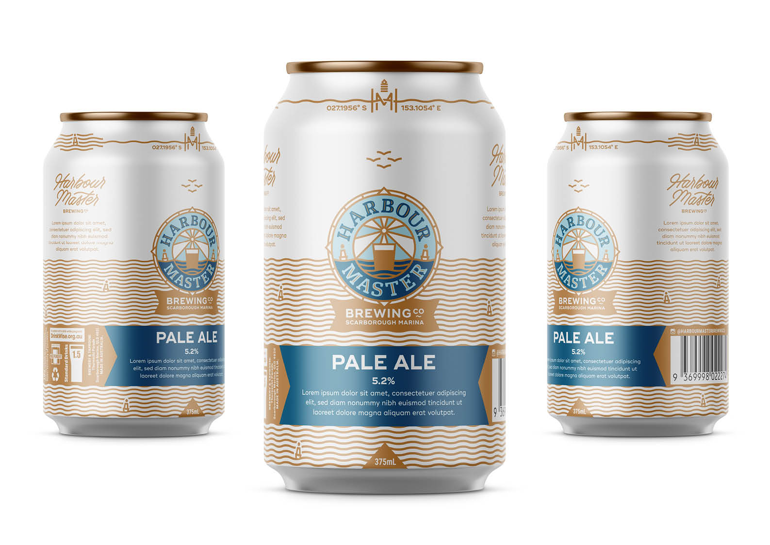
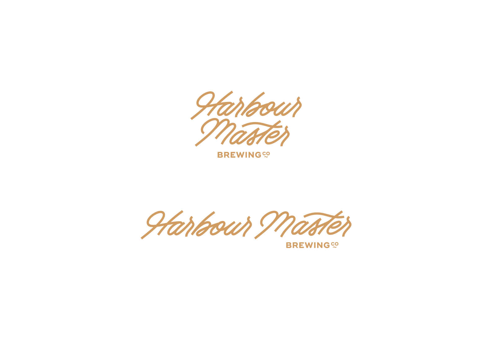
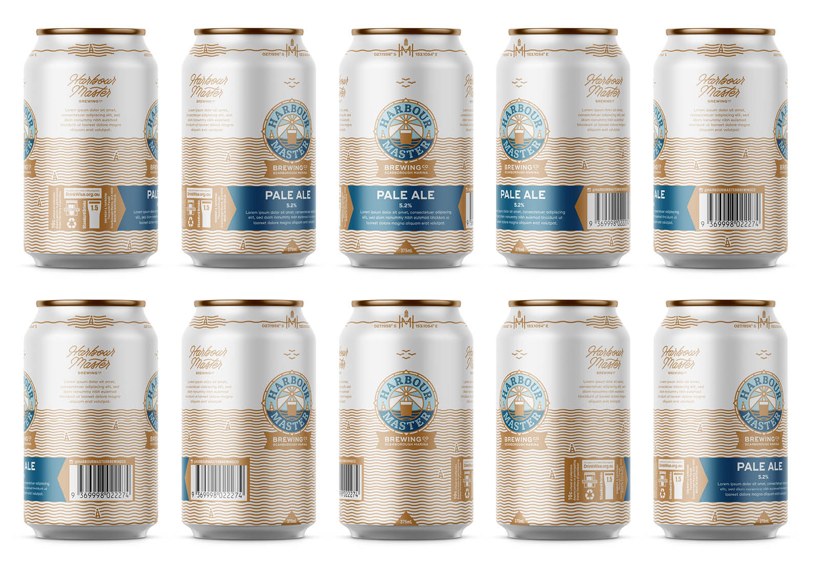
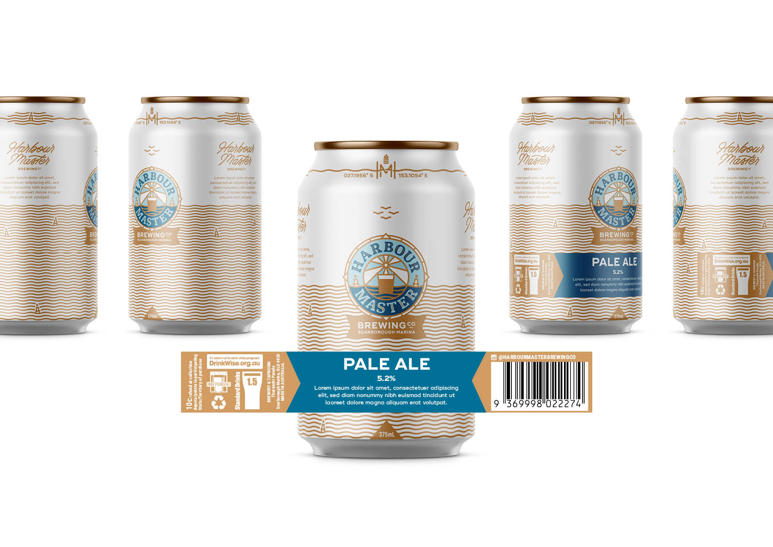
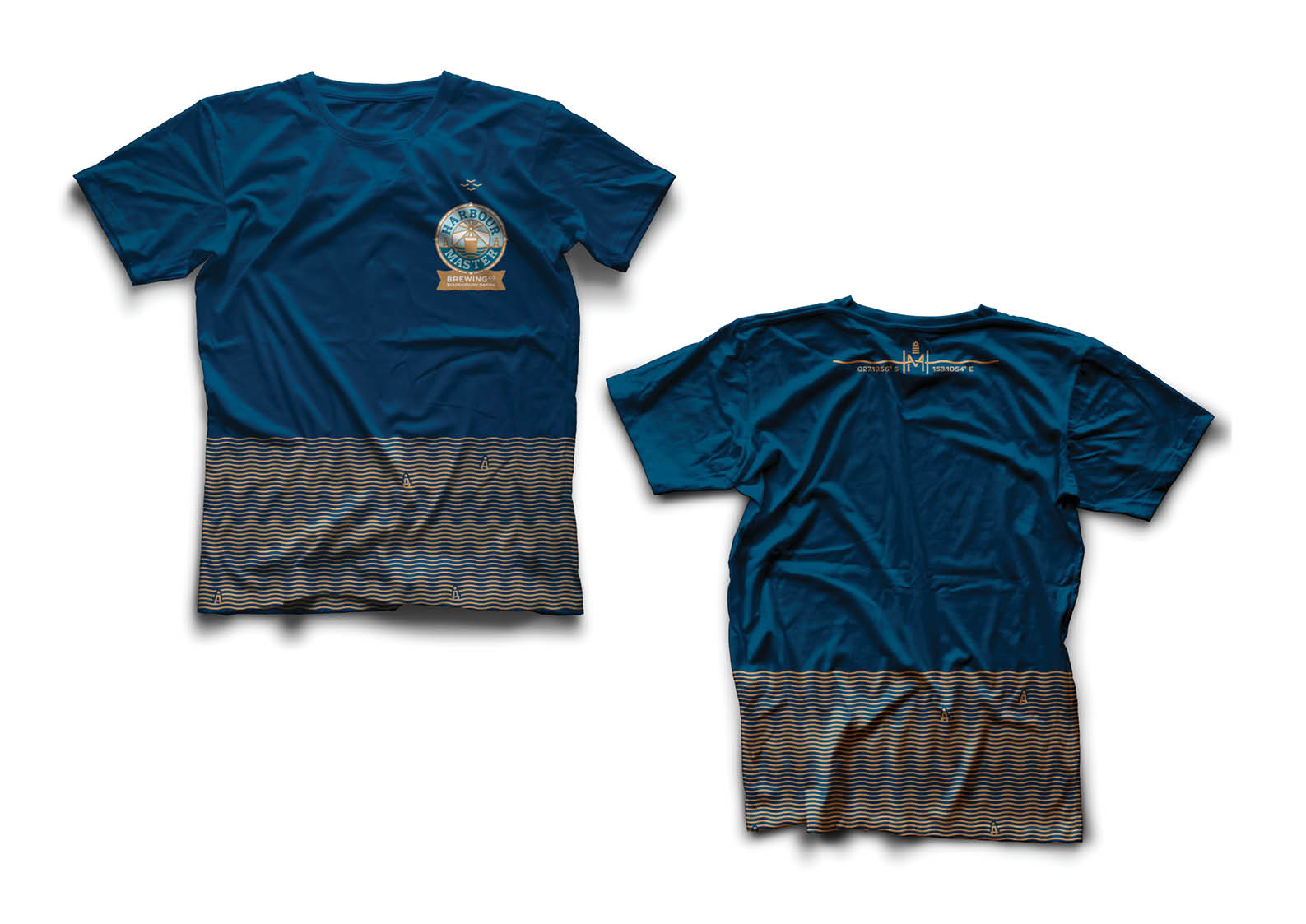
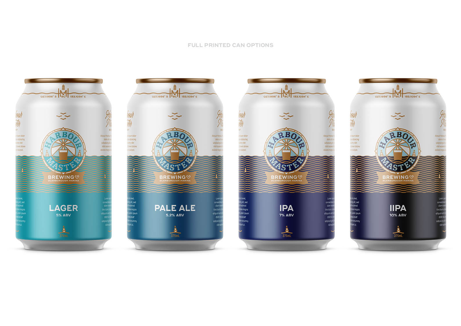
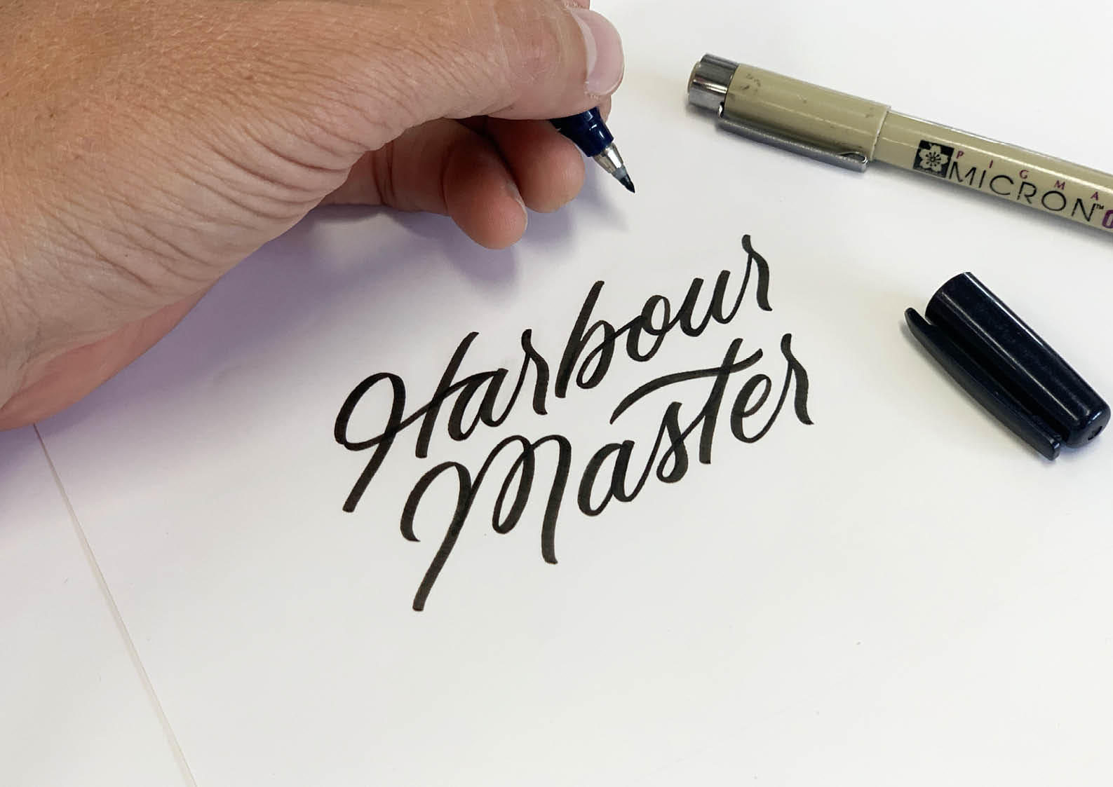
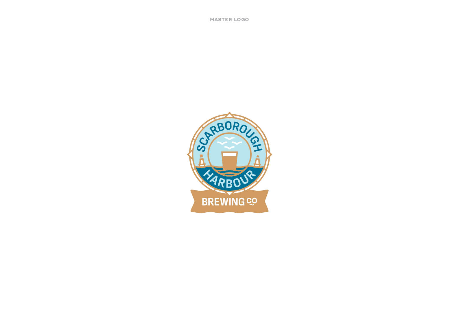
Developing a comprehensive visual identity for a craft brewery always comes with its own unique challenges and strategic shifts. In the case of Scarborough Harbour, the project required a critical, 11th-hour name change from its initial working title, Harbour Master.
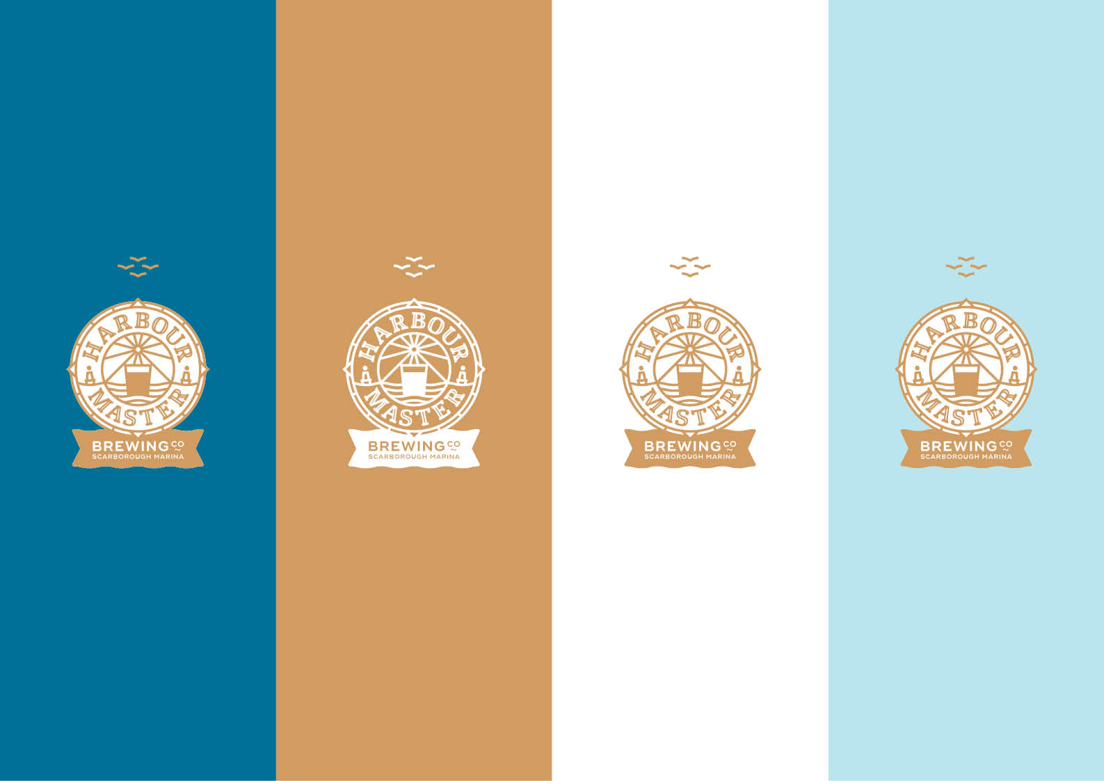
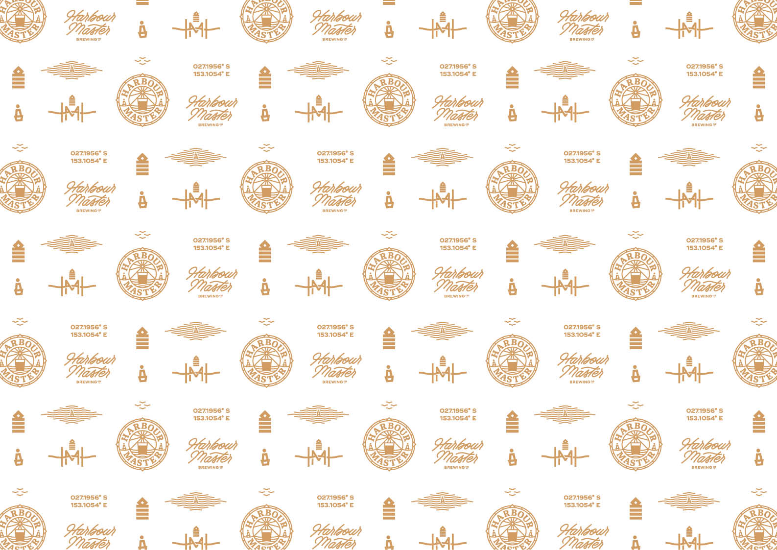
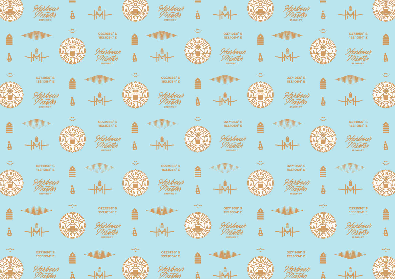
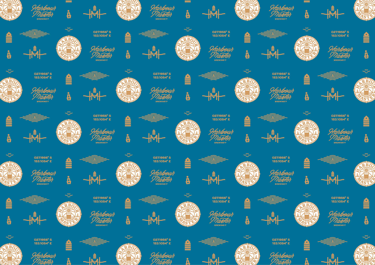
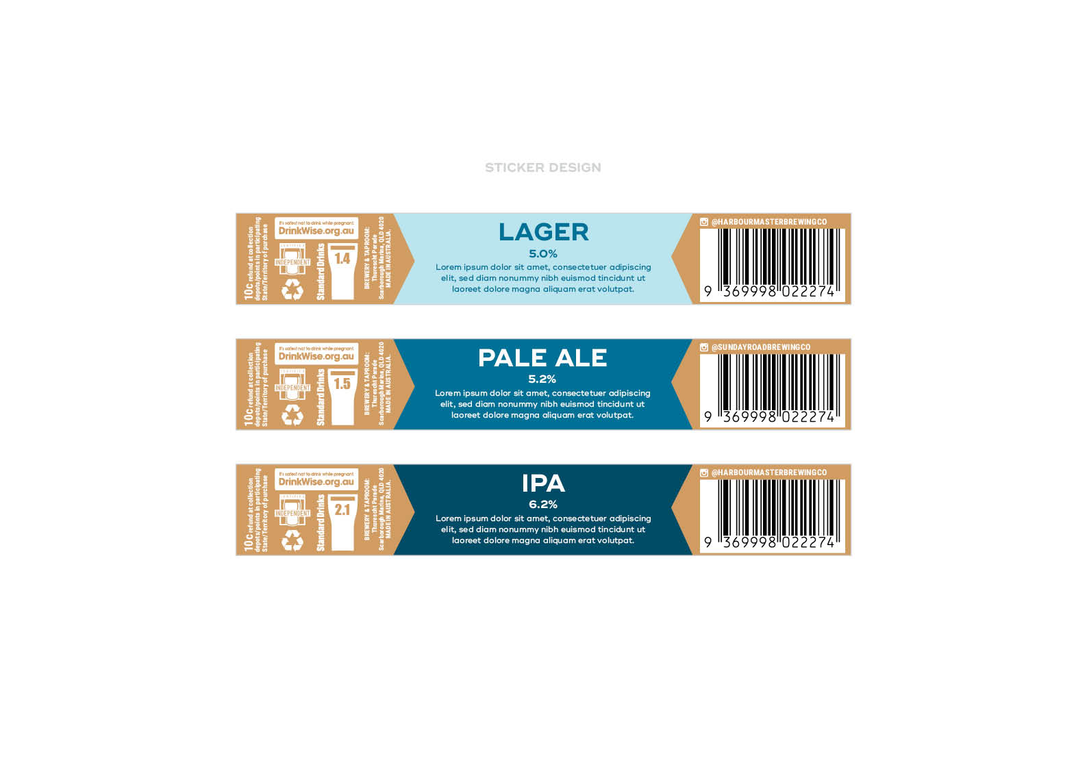
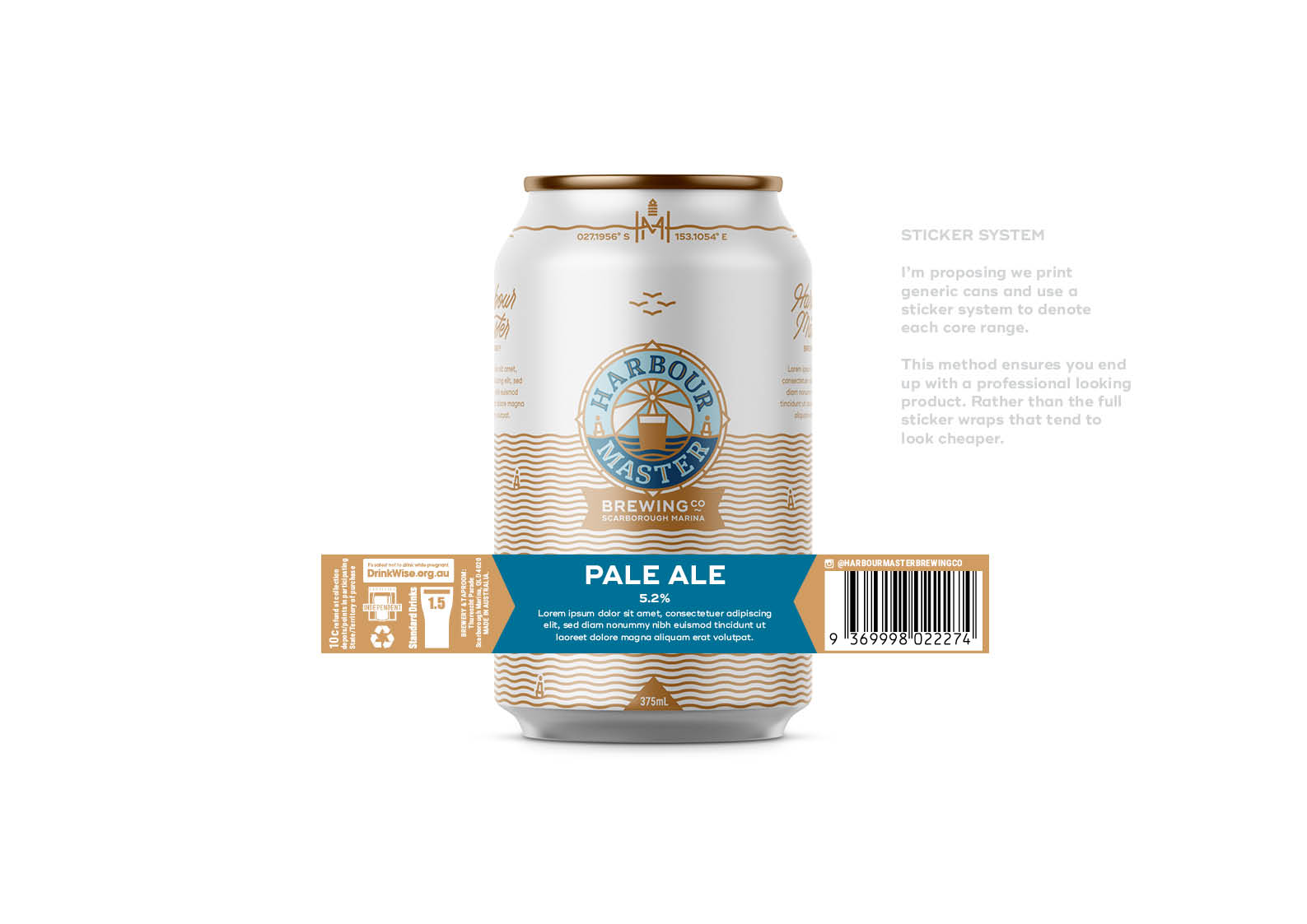
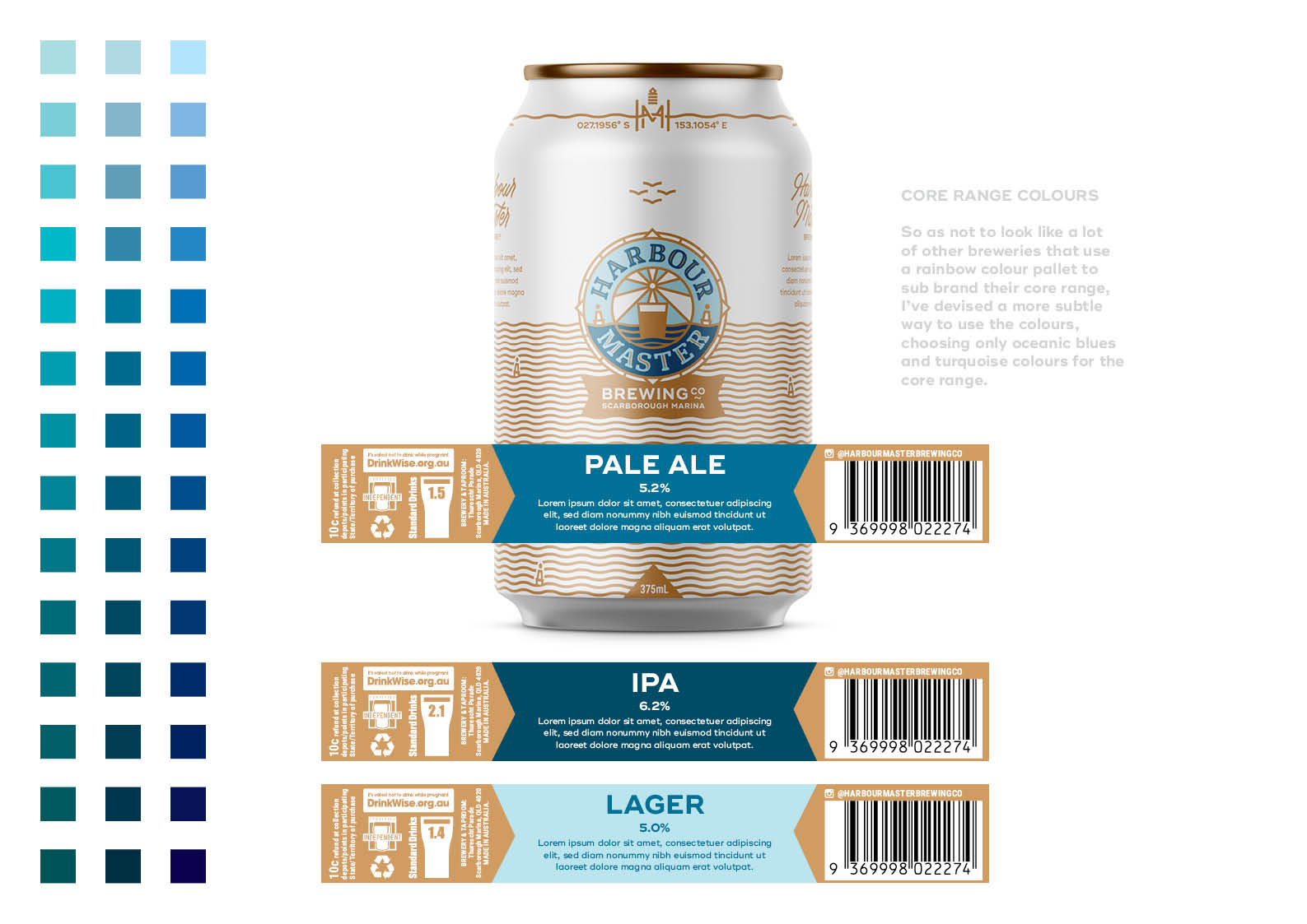
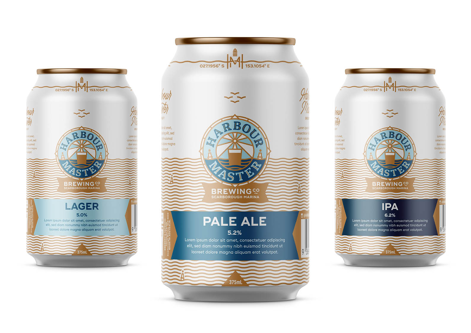
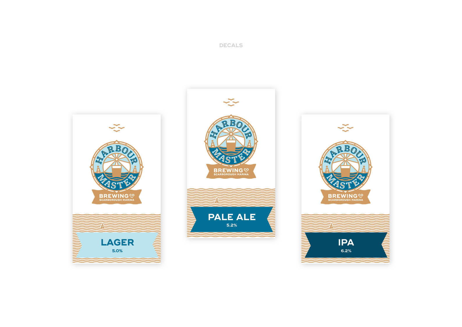
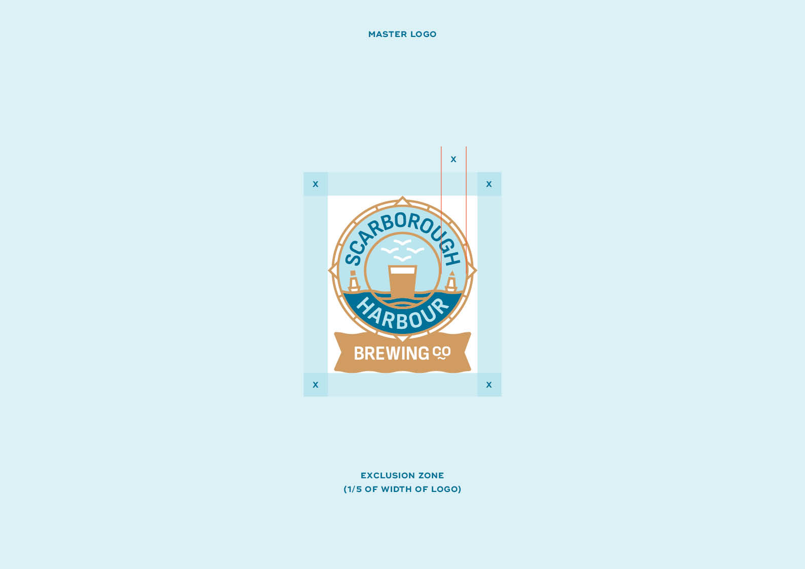
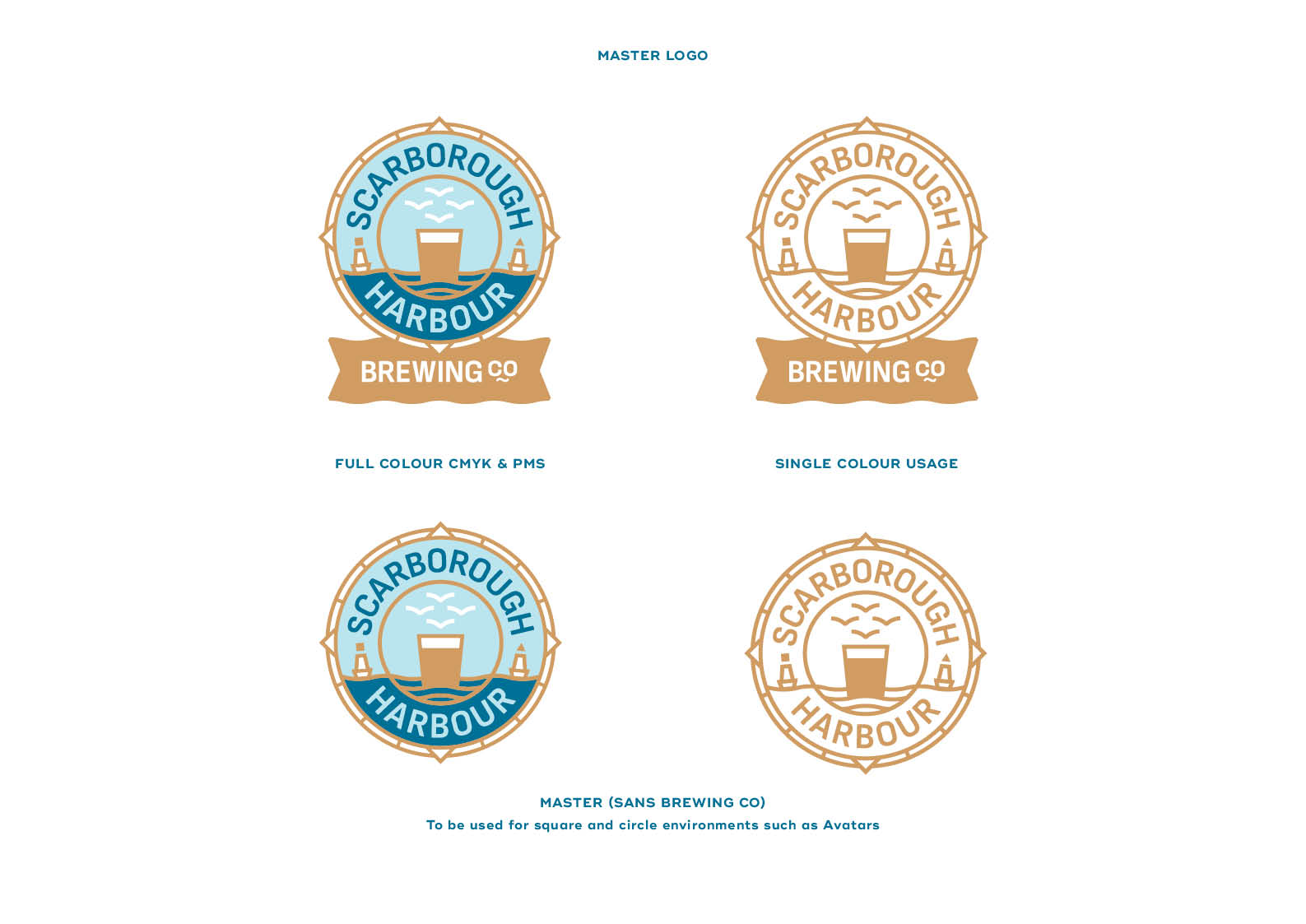
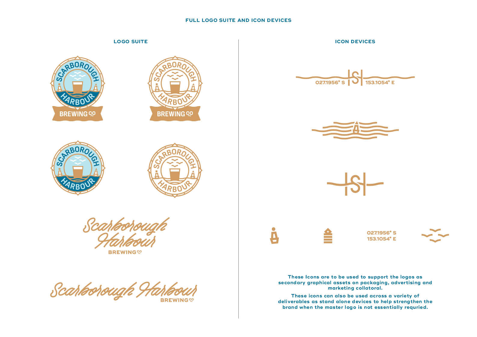
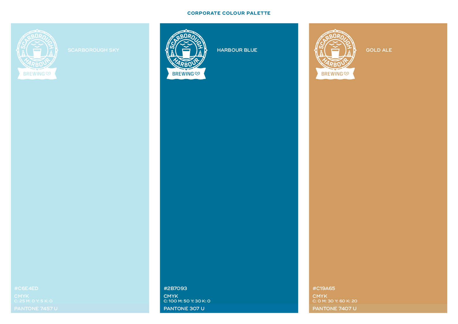
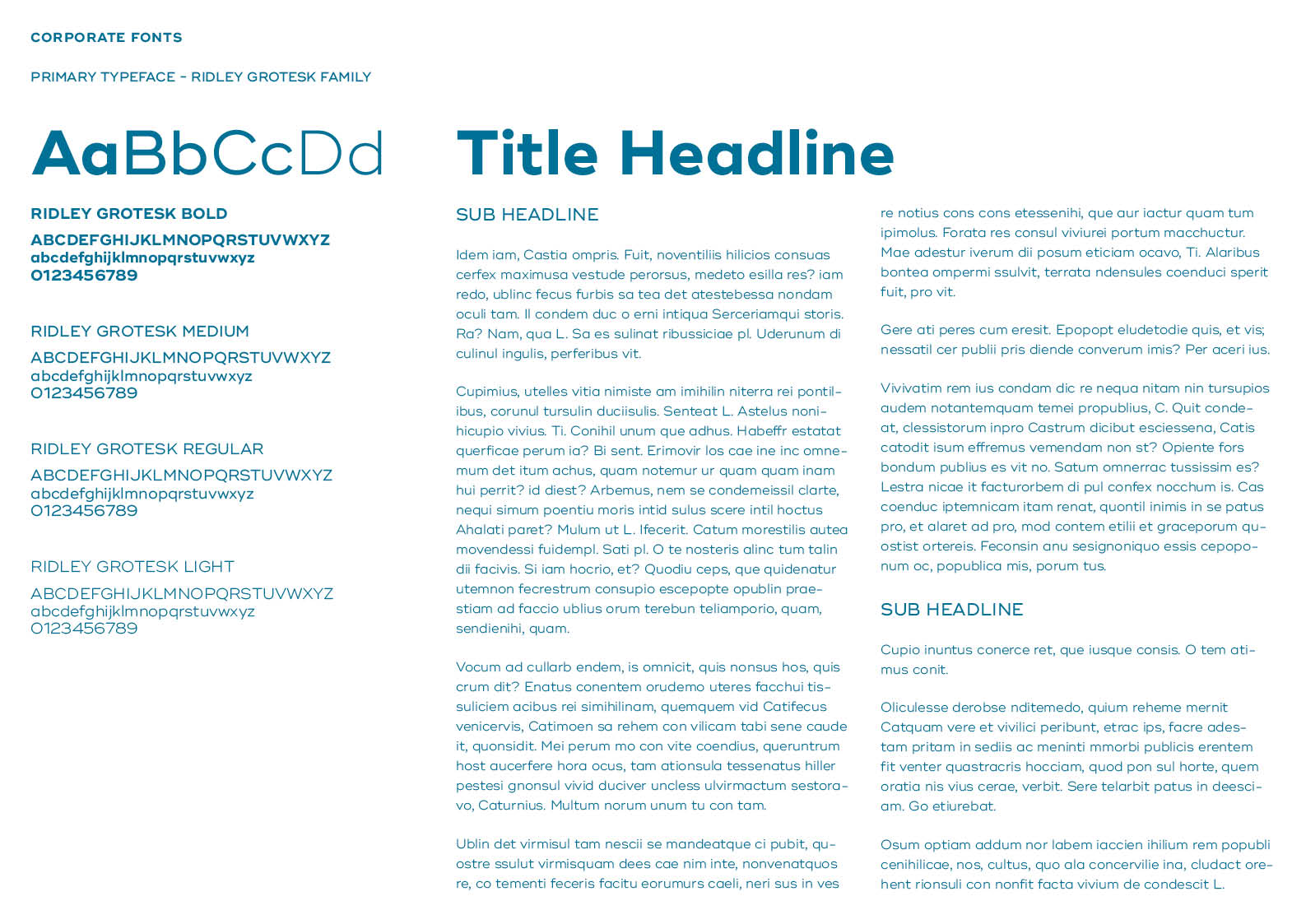
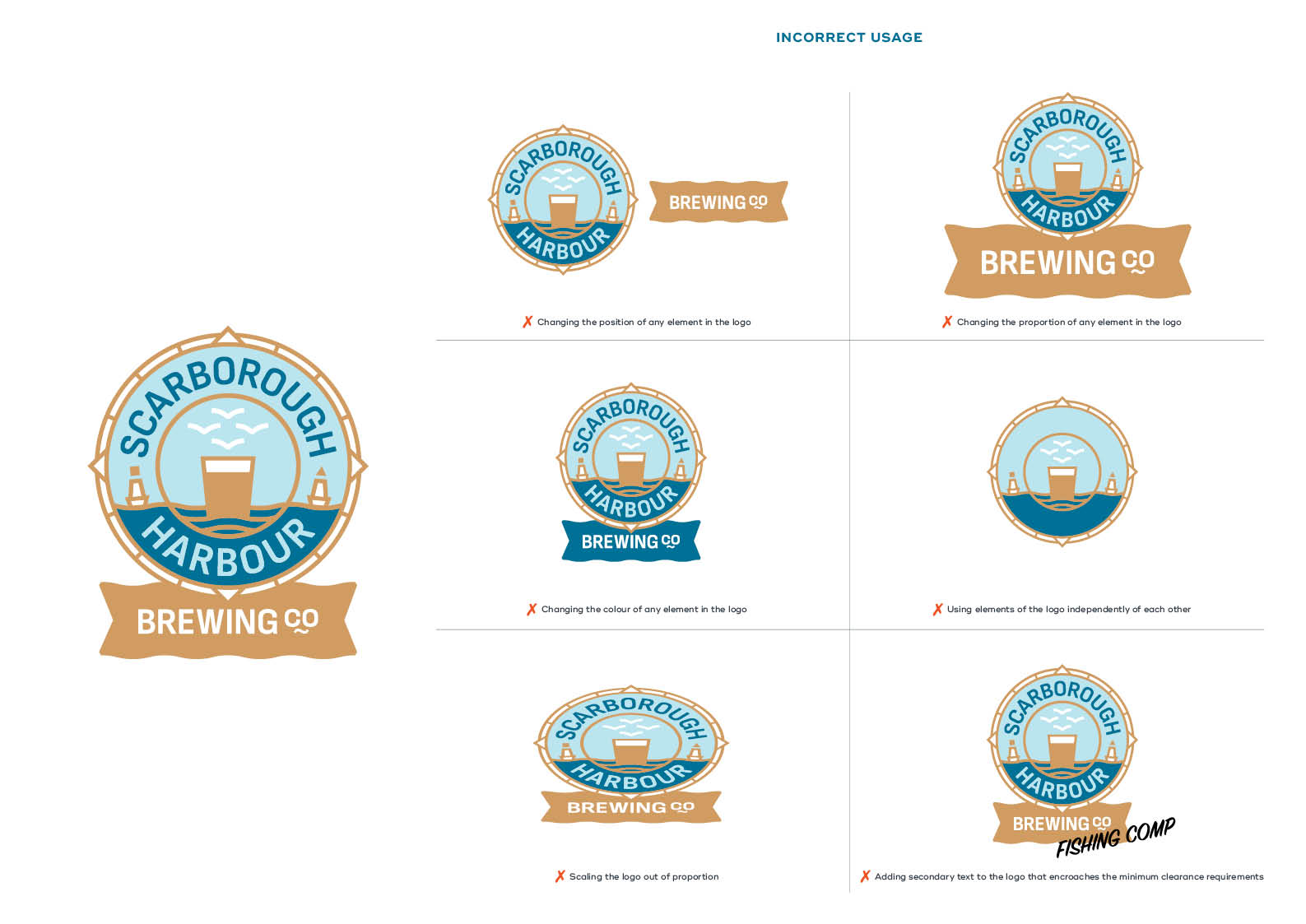
Because the strategic timeline demanded an immediate rollout, the foundational brand identity presentation features the original conceptual name. However, the core brand systems, including the corporate colour palette, custom typographic selections, and the extensive visual language of illustrations, patterns, and icons—translated seamlessly to the finalised Scarborough Harbour marque.
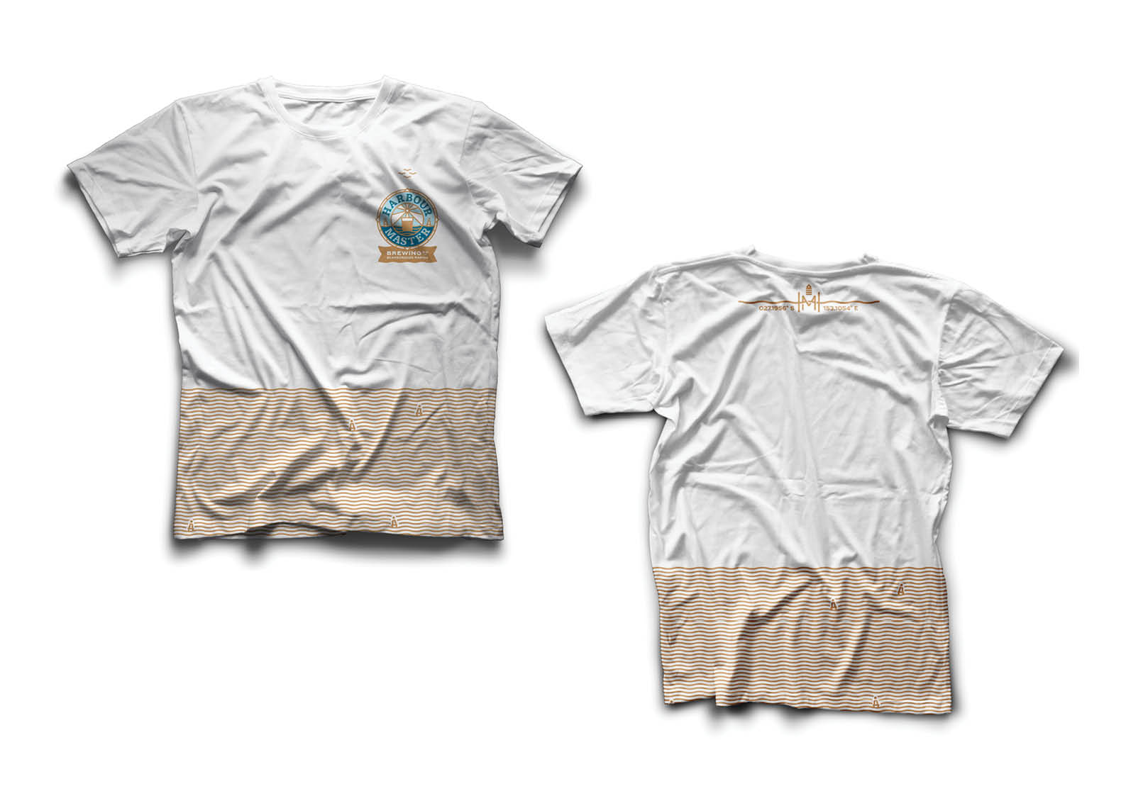
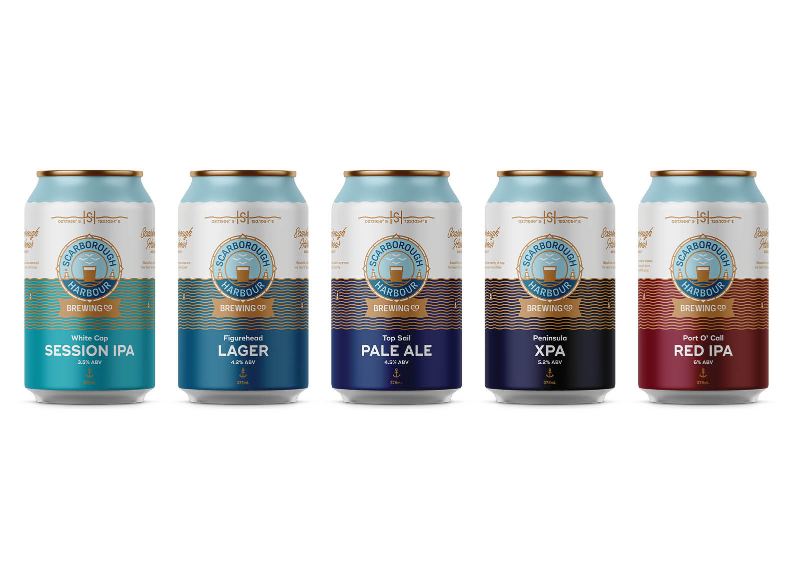
Below, explore the complete design journey showing how a flexible branding system adapts perfectly from initial concept sketch to the final taproom application.